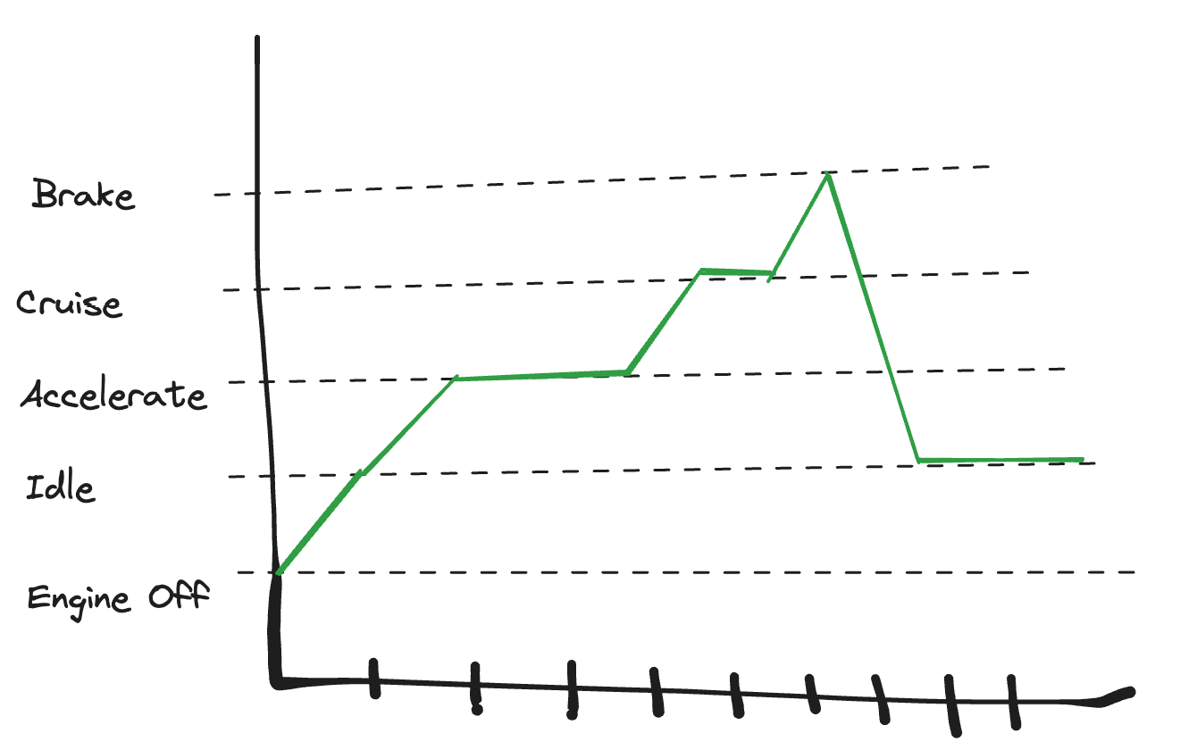
I’m trying to visualize transitions between different states over the course of time. To help understand the issue, pretend I have time series data about a car as someone is driving it. The states might be
Engine Off
Idle
Accelerate
Cruise
Brake
Over the course of a drive, the car will transition between these various states. I want a time series chart that will allow me to visualize how long a user is in each one of these states and the transitions between them.
So far, I’ve tried converting each of these state values into a number representing that state and then plotting it over time. Technically that works, but as a viewer of the graph, I don’t know what “4” might actually mean. So one way of improving this would be to allow me to map/format the numbers as the text descriptions, or at least have a tooltip that could show the label.
Thank you for raising this case. My apologies for the late respond!
May I check if you still need assistance with this issue, or if you have found a solution for this?
In case this issue is still relevant, I’d love to ask for more details:
Can I confirm that the data you want to plot would look somewhat like this?
event_id
created_at
state
1
2023-01-01 0:00:00
1. Engine Off
2
2023-01-01 1:00:00
2. Idle
3
2023-01-01 1:15:00
3. Accelerate
4
2023-01-01 1:40:00
4. Cruise
5
2023-01-01 3:00:00
3. Accelerate
6
2023-01-01 3:10:00
4. Cruise
7
2023-01-01 3:30:00
5. Brake
8
2023-01-01 3:31:00
2. Idle
Also, could you share a a sketch/screenshot of your ideal result? This would help us tremendously to understand what you want to achieve.
Thanks for the helpful visualization, @SterlingParamoreMSE!
Also, this is a very interesting use-case. Thank you for raising it as well.
Unfortunately, at the moment we haven’t got a way to plot this natively, as the Line chart’s Y axis doesn’t support string.
Since you’re already trying representing the State with number, perhaps a Text widget alongside to explain what each number means might be somewhat useful for your viewers?
I’ve raised your case and the ideal result with the internal team now. Will make sure to consider it for our visualization advancement.
In the meantime, do ping me any time if you need further assistance. Cheers, @SterlingParamoreMSE!