Hi community! 
September always feels like the start of a new term, so we spent it sharpening pencils: tightening layouts, fixing the things that made you look twice, and making the words on screen say what they actually mean. Here’s what changed.
Reporting
-
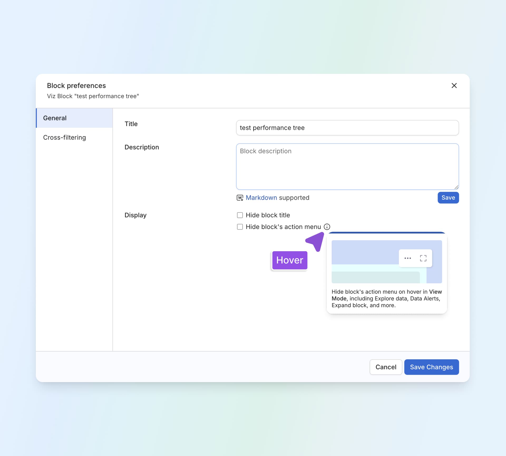
Explore polish: Consistent header height, tidier spacing in button groups, properly aligned Dev mode buttons, a better-behaved suggested-chart button, and consistent styling for timezone and period-over-period missing-time notes.
-
Dashboard IDs no longer cut off: Long IDs display in full, and alerts stop reporting “Unexecuted” when they have actually run.
-
Cleaner filled map settings: We removed the blank space under the colour formatting section, and field values now line up with the colour scale button.
-
Rename right where you’re reading: The pencil icon now sits at the end of the title instead of floating mid-line.
-
One less banner in Reporting: Removed a banner that took up room without adding much.
-
Recents shows a loading state: Recents used to flash an empty state while it was still fetching. It now shows a proper loading state, so you know data is on its way.
-
The action tab closes properly: The action tab and its modal can be dismissed again, and failed actions now fail gracefully instead of leaving you stuck.
-
Ask AI button height: The Ask AI button will line up with the height of the buttons beside it.
-
Beta badge restyled: The beta badge is moving to our standard blue styling.
-
Full-width banner: A banner that currently stops short of the edge will span the full width.
-
Clearer drag-and-drop in viz settings: When you drag a field onto a chart, we’ll show you which field the drop is about to replace.
-
Info popover stays out of the way: The field info popover will stop covering the row it belongs to.
Development
-
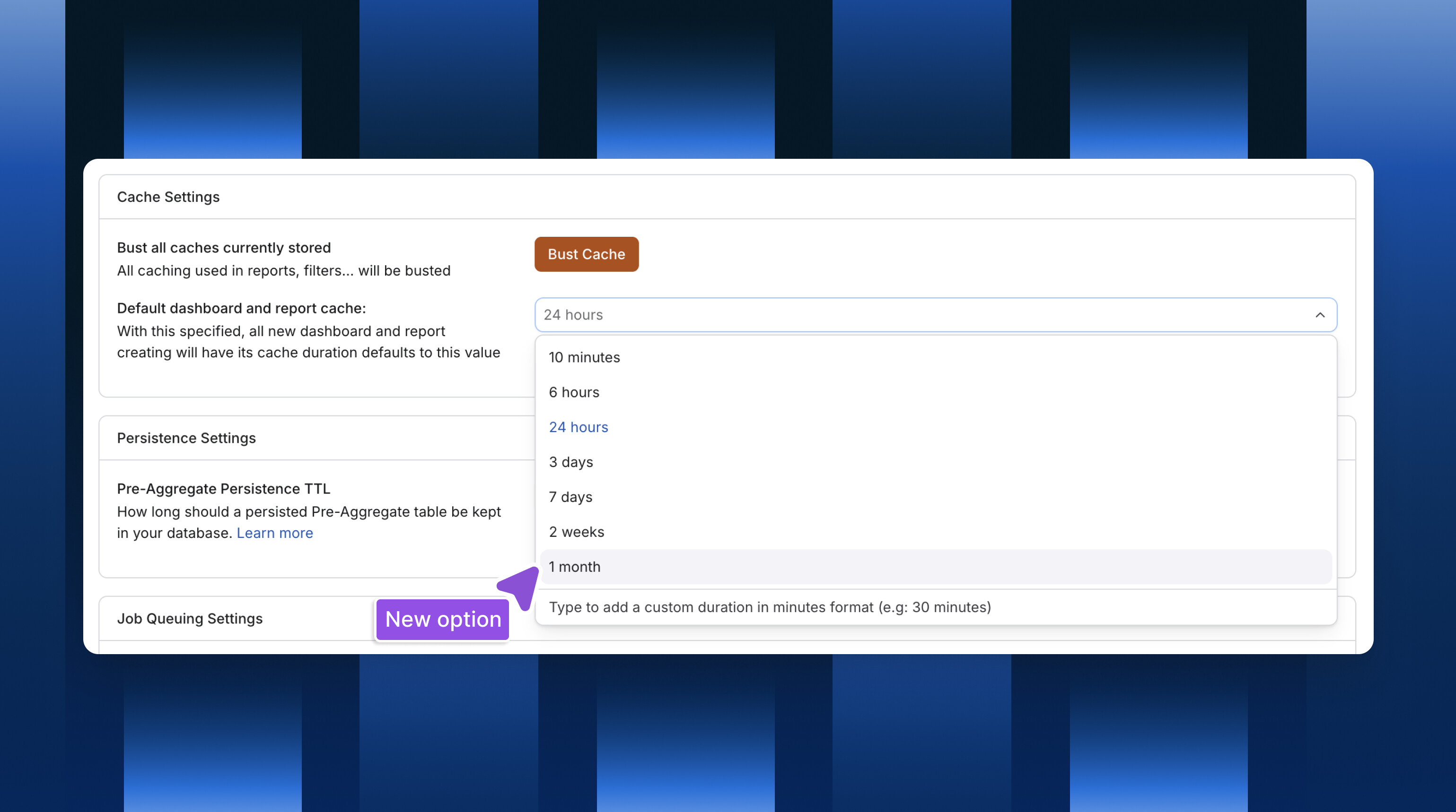
A one-month cache option: Cache settings will offer a 1 month duration.
-
Refreshed Add menu icons: New icons across the Add menu and the explorer tree.
-
Bottom panel overlays the Data view: Opening the bottom panel no longer squeezes the Data view. It overlays instead, so your table keeps its height.
-
“Visual” is now “Preview”: Renamed with an eye icon, matching what you’d expect from other IDEs.
-
Clearer SQL editor empty state: Shorter, more useful copy that follows our writing guidelines.
-
Better read-only tooltip: The “Master branch is read-only” tooltip now follows our tooltip guidelines, with no stray quotes and consistent styling.
-
Errors you can actually read: Messages that showed
[object Object]now show the real error. -
Roomier object label editing: Table cells have proper padding and code snippet boxes stop overflowing while you edit.
-
Project settings fit with AI chat open: Fixed an overflow so Project settings stays readable alongside the AI chat panel.
-
Dashboards show that they’re loading: Opening a dashboard in Development will make it clear data is on its way, instead of sitting there looking blank.
-
Sidebar polish: Padding will hold at minimum width, the Version control nav bar will line up, and the stray border above the search box (file filter applied, scrolled down) is going away.
General UX & UI enhancements
-
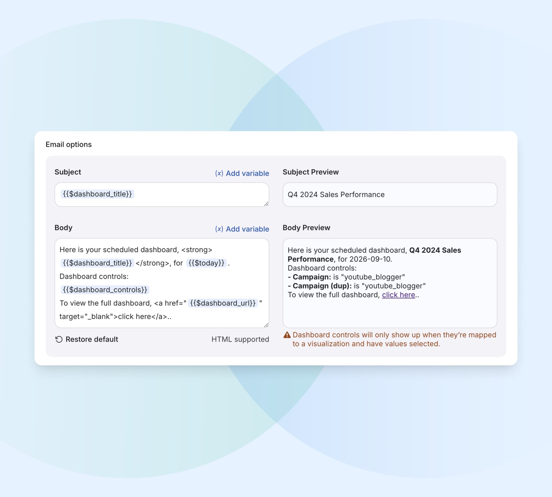
Tidier schedule export modal: We standardised the gaps between labels and inputs, and the Restore button now appears only when there’s something to restore.
-
Avatars are back: Fixed Gravatar images failing to load.
-
Profile icon hover: The profile icon in Profile settings no longer turns blue on hover.
-
Favourites update immediately: Starring something will show up right away, with no refresh needed.
None of this is the kind of thing you’d write a feature announcement about, but it’s the kind of thing you feel every day. Most of these started as something one of you noticed and told us about, so keep it coming. See you next month! 