Hi community! 
This month we’ve been polishing lots of small-but-mighty UX details — the kind that make everything feel a bit smoother, clearer, and more consistent as you move through the app.
Here’s what’s new:
General UX & UI Enhancements
-
More breathing room at the bottom of pages: We added bottom padding so pagination controls no longer feel like they’re glued to the edge of your screen.
-
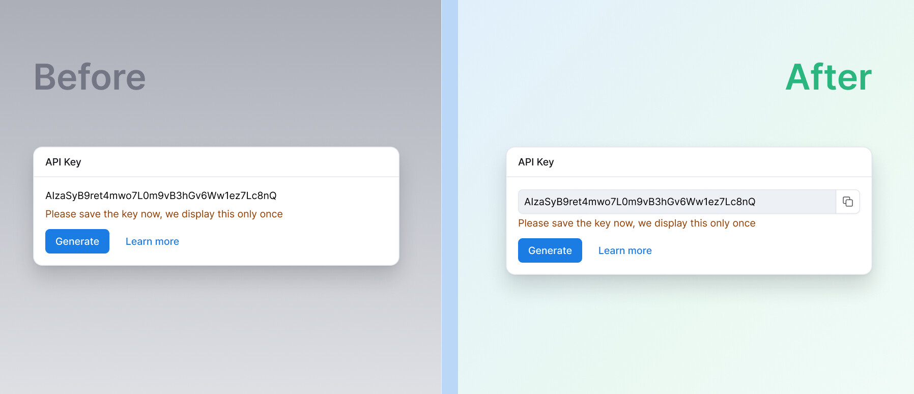
Updated copy button icons: Copy buttons now match our new icon style, keeping visuals consistent across the product.
-
Cleaner button styling: Removed an unwanted underline style on button components that link to docs, so they look (and behave) more like buttons.
-
Shorter “Last cached time”: Time formats are now more compact — e.g. “19 minutes ago” becomes “19m ago” — for a quicker scan.
-
Warning banners that read better: Banner alerts now use black text on an orange background for improved readability and closer alignment with our design system.
-
Tidier onboarding layout: Fixed an alignment issue on the onboarding screen for a more polished first impression.
-
Faster “Copy” in members’ spaces: If “Copy” only has a single sub-action, we now show Copy to directly (fewer clicks, more doing).
-
[Coming soon] Quick copy for API keys: We’re adding quick copy support so keys are easier to grab right after generation.
-
[Coming soon] Underline consistency: We’re standardizing underline styles across a few areas to keep things visually consistent.
Navigation & interactions
- Move-to-folder flow fixed: Resolved an issue that prevented moving an item into the currently opened folder — the Submit button now behaves as expected.
- Corrected the
Entericon: Replaced an incorrect icon for theEnterkey with the proper one. - [Coming soon] A more predictable color palette popover: We’re aligning the popover width with its trigger and improving internal sizing.
- [Coming soon] Easier scrolling in long color palette lists: We’re exploring a sticky right-side panel so you can browse long lists without losing context.
Integrations
-
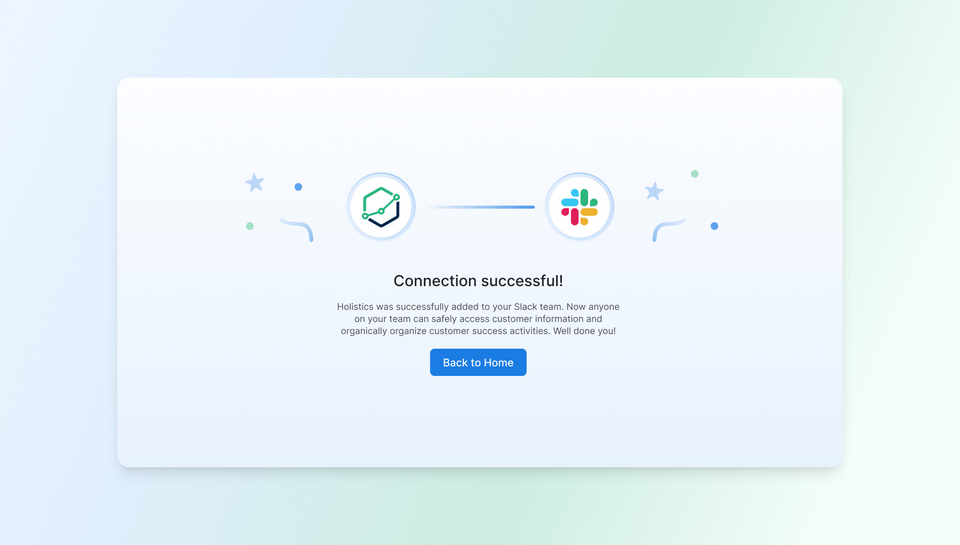
[Coming soon] A fresher “Connected to Slack” success page: We’re redesigning the success page for a clearer, more polished integration experience.
Development
-
[Coming soon] Models panel polish: We’re updating the loading spinner + helper text for a smoother dataset file view experience.
-
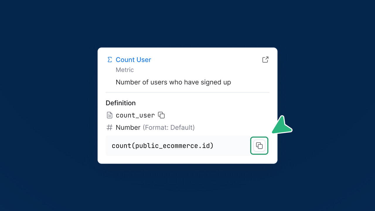
[Coming soon] Copy in metric definitions: A dedicated copy button is on the way for faster copying of metric logic.
Navigation & interactions
- [Coming soon] Clearer group selection copy: In “Add to Block Library”, we’ll make it more obvious you can search or create a new group.
- [Coming soon] A distinct icon for Code Search: We’ll use a dedicated file-search icon to better differentiate it from Project Explorer search.
That’s it for this month.
Thanks as always for the feedback — it’s what keeps the polish coming. See you in the next roundup! 