Hi community! ![]() This month we’ve been tidying up details across the product — fixes and improvements that make everyday interactions feel a little smoother and more consistent.
This month we’ve been tidying up details across the product — fixes and improvements that make everyday interactions feel a little smoother and more consistent.
Reporting
-
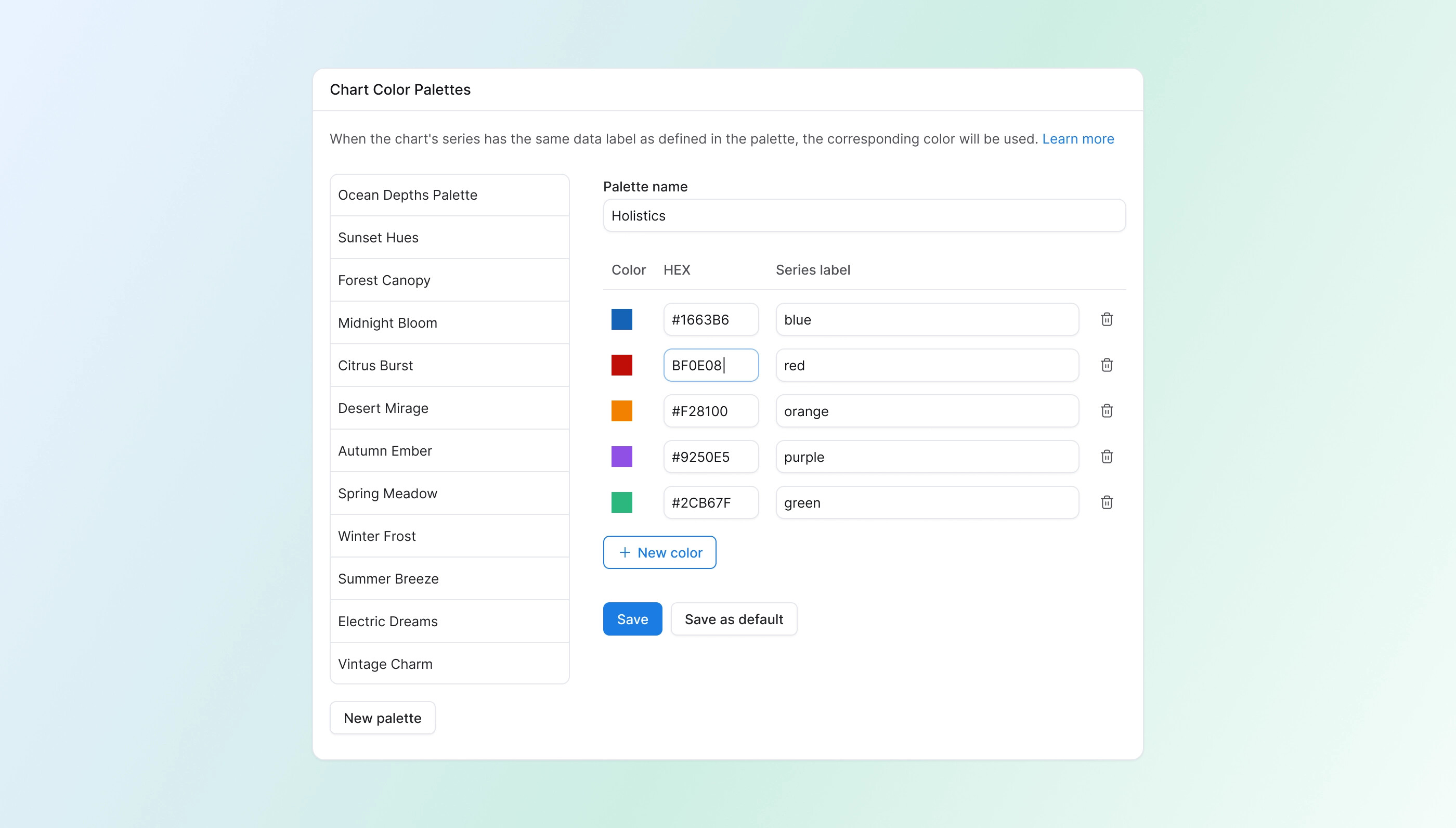
HEX color input now visible in Chart Color Palette editor: Previously the HEX field was hidden. Now you can edit colors directly from the table.
-
Sticky panel for long color palette lists: The color table — including colors, HEX codes, and labels — is now always visible as you scroll through long palette lists.
-
Chart data panel no longer covers the chart: When you expand the Chart Data panel, the chart now always stays visible.
-
Color palette popover width fixed: The popover now matches its trigger width properly.
-
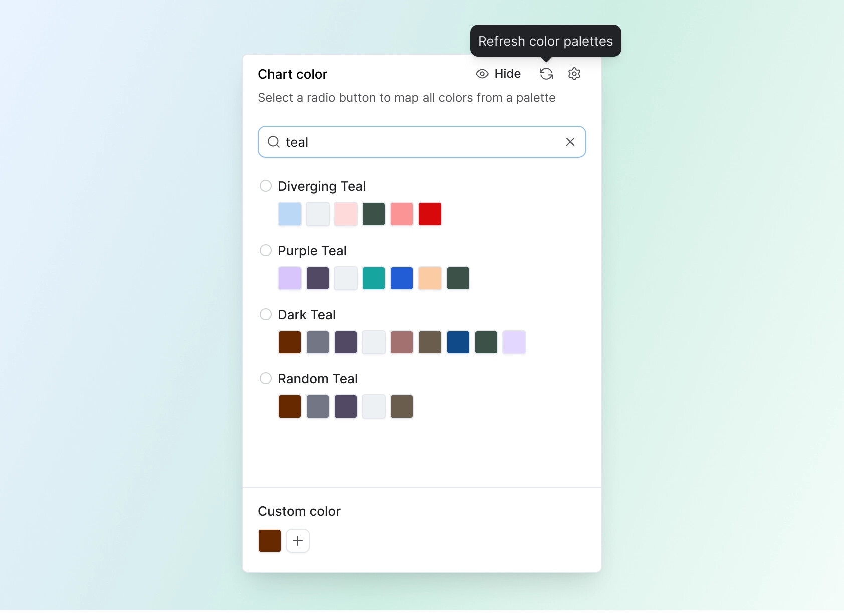
[Coming soon] Search for color palettes: A search bar is coming to the Chart Color panel so you can find palettes quickly by name.
-
New shortcut: open dashboard in Development from Reporting: You can now right-click a dashboard in the navigation tree to jump straight to its Development view — no need to open it in Reporting first.
-
[Coming soon] Refresh button for color palette: A sync button will let you pull in the latest palette changes without refreshing the whole page.
-
[Coming soon] Better visibility for cancel button when using cross-filter: The cancel button currently looks disabled and has very low contrast on dark backgrounds. We’re improving contrast so it’s clearly visible and actionable.
-
[Coming soon] Data Schedules modal flickering fix: The config modal will no longer flicker while a schedule is running.
Development
- Distinct icon for Code Search: Code Search now has a dedicated file-search icon, making it easier to tell apart from Project Explorer search.
- Looker Migration Assistant copy & layout fixes: Corrected copy and layout issues in the Looker migration flow and project settings.
- Copy button in Metric definitions: A dedicated copy button is now available for faster copying of metric logic.

Integration
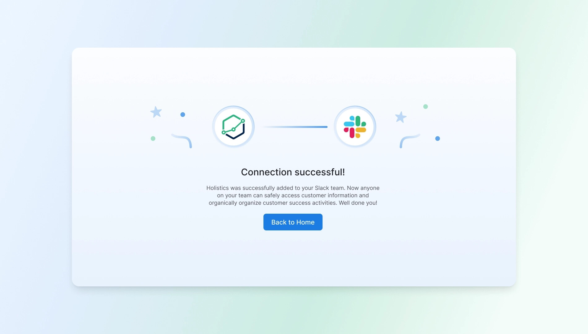
- Redesigned “Connected to Slack” success page: Cleaner, more polished integration experience after connecting Slack.
General UX & UI enhancements
- Active state for dashboard menu buttons: Buttons in the dashboard menu now show a proper active/selected state.
- Smaller spinner in dataset file view: Reduced spinner size in the Models panel for a cleaner look.
- Updated SVG icons with new names: Icon assets refreshed and renamed for consistency.
- [Coming soon] Consistent toast/alert placement: Notifications will now always appear at the top center for a consistent experience.
- [Coming soon] Billing usage table fix: Resolving a broken layout in the usage details table.
That’s a wrap for this cycle. Thanks for the feedback — it keeps the polish coming. See you in the next roundup! ![]()