Hi community,
We are pleased to announce this month’s product enhancements. Following extensive user feedback, our team has prioritized improvements to interface design and overall usability. Below is a summary of the updates:
General UX & UI
-
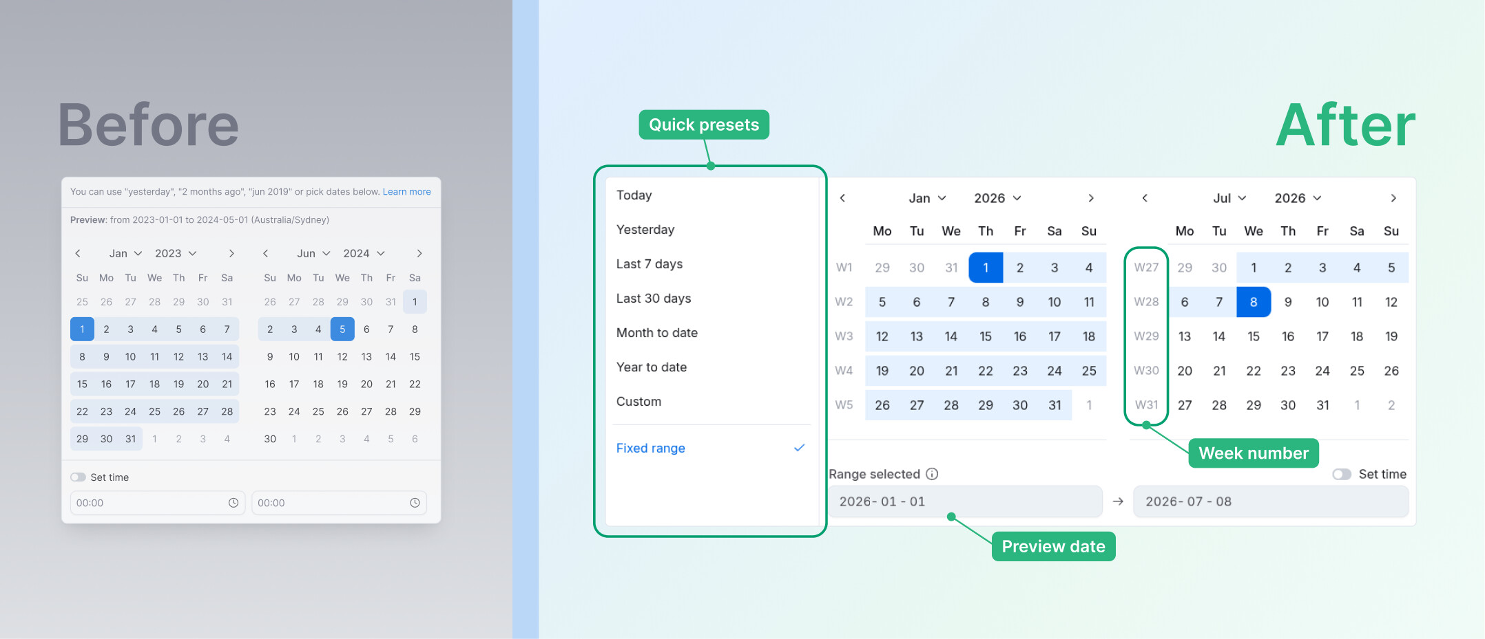
[Coming soon] DatePicker enhancements:: You can now pick from quick presets like Today, Last 7 days, or Month to date, plus see week numbers and a live preview of your selected range, making date selection faster and more precise.
-
Standardized text colors in chart style settings to ensure a consistent look and feel.
-
The janky animation in the Metric definition’s reference section has been removed for a smoother user experience.
-
Replaced several SVG icons with updated versions and renamed for better organization and visual consistency.
-
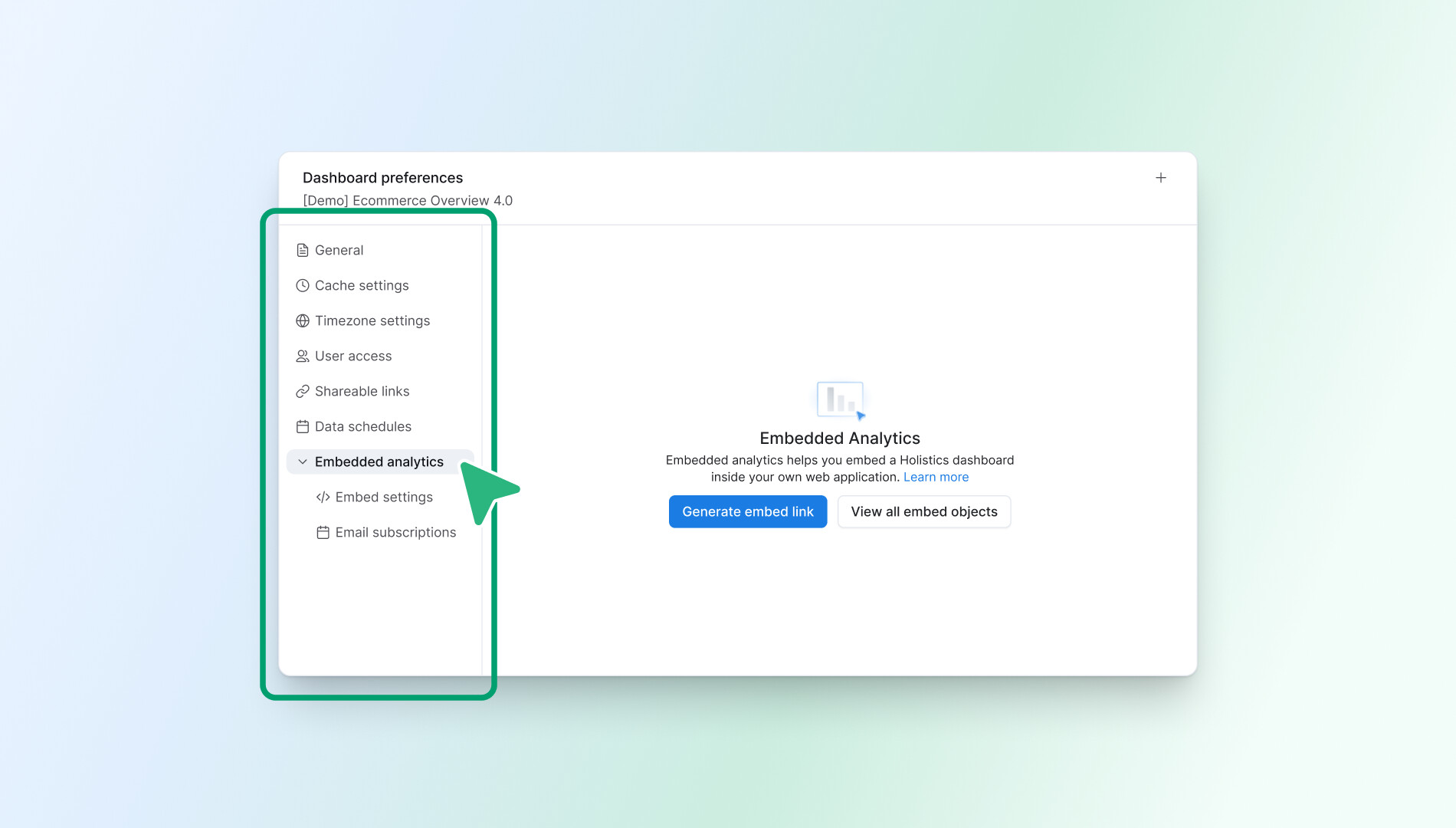
Dashboard preferences just got a refresh: new style with nested toggle options for better organization.
-
Fixed a UI bug where a dropdown menu was sometimes hidden behind the “Create relationship” card, ensuring all menu options are visible.
-
We’ve corrected a typo on the service unavailable page for improved text accuracy.
-
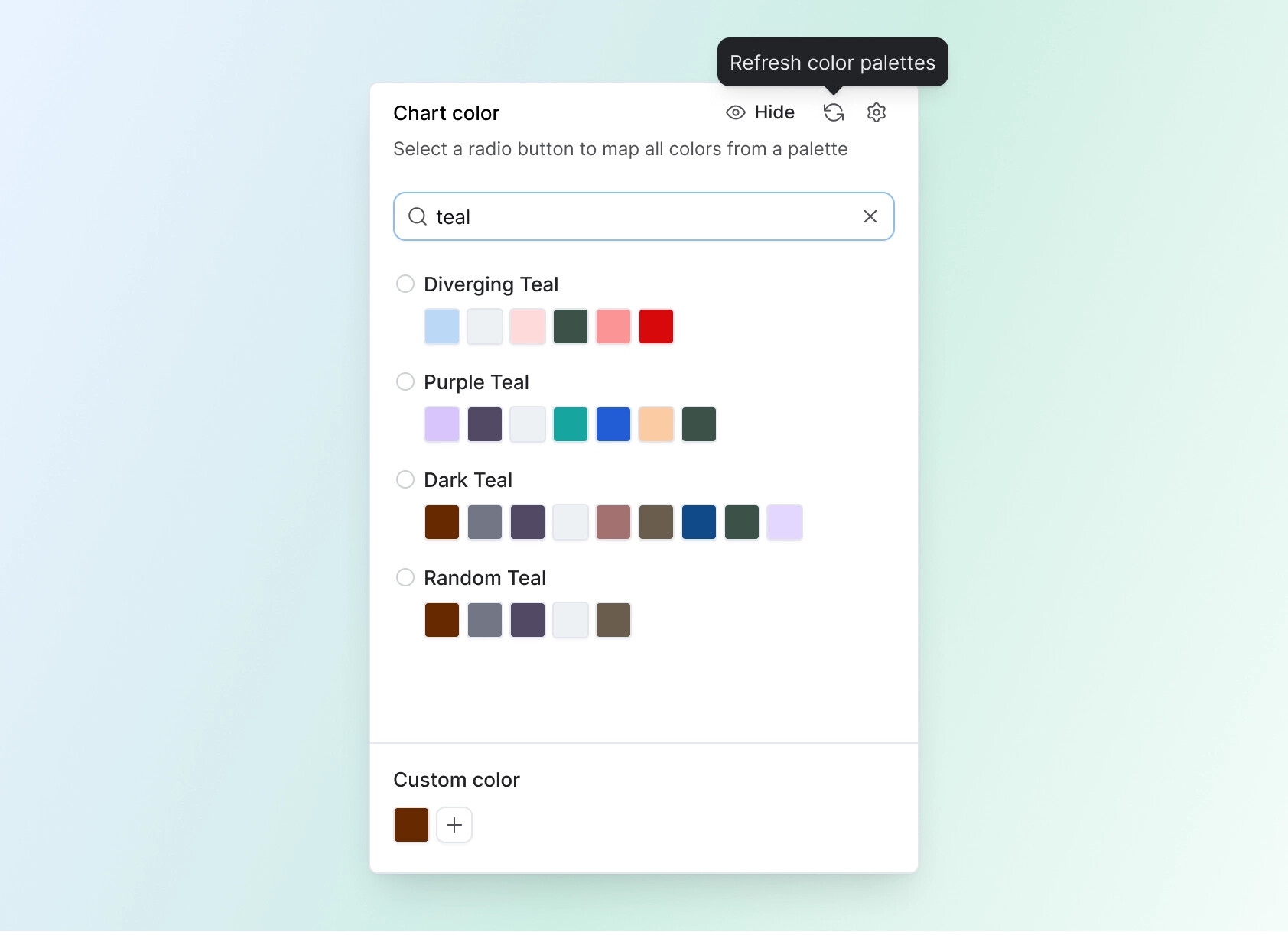
Color palettes improvement: You can now search for color palettes with case-insensitive filtering, plus a refresh button to quickly update the popover without reloading the page.
-
Standardized the placement of all alert notifications to appear consistently at the top center of the screen, improving user experience.
-
Fixed an issue where cancelling the Gravatar disable action didn’t revert the UI toggle state. The toggle now only updates after your confirmation.
-
The custom date format sidebar will now automatically select the first default option, making it quicker to choose a format.
-
The ‘Learn More’ link in the ‘view underlying data’ viewer tooltip now directs to the correct documentation page.
-
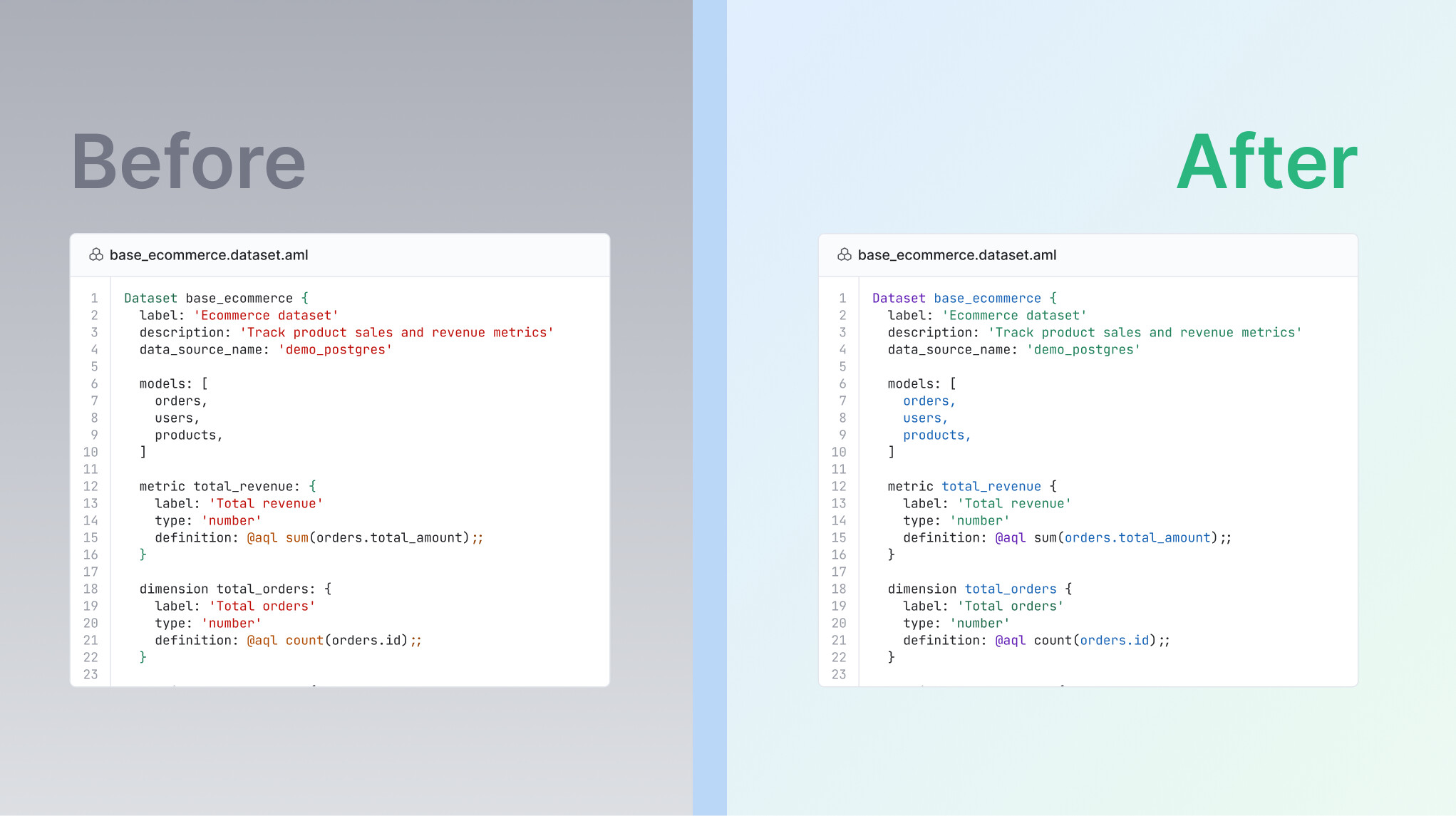
[Coming soon] New syntax highlighting: The editor now features refined color coding for keywords, strings, types, and functions, making your code easier to read at a glance. This visual distinction helps you quickly scan through your work.
Reporting
-
Fixed a bug where the Data Schedules config modal flickered while a schedule was running. The modal will now remain stable even with background status updates.
-
Renamed “Add canvas dashboard” to “Add dashboard” for clearer and more concise labeling.
Development
-
When resolving conflicts, an option will now be automatically pre-selected, making the process smoother and more intuitive.
-
The “Up-to-date” label will no longer break into multiple lines when the AI chat panel is open, ensuring it displays correctly.
-
We’ve fixed an issue where the tooltip in commit history displayed incorrect times when hovering over timestamps.
That wraps up this month’s updates  .
.
Thanks for keeping the feedback coming. It truly guides where we go next and more good things are in the works. See you next time!