Hi community,
Happy to share this month’s goodies with you! We’ve been on a mission to smooth out those bumps and add some extra shine ![]() . Here’s what we’ve cooked up:
. Here’s what we’ve cooked up:
Reporting
-
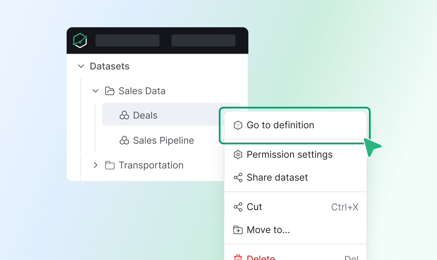
Dataset navigation to development - Added quick access to dataset definitions directly from the sidebar for faster navigation.
-
Fixed an issue where tree items would shift out of alignment when hovered over.
-
The “Empty visualization” message is now correctly vertically centered, improving the aesthetic balance of empty charts.
-
Unfriendly error messages for incorrect exploration URLs have been replaced with a more helpful one, guiding users to double-check their links.
-
The timezone display in the dashboard bar now uses a proper button component with an updated, darker tooltip for better visibility.
-
When hovering over truncated email addresses in data delivery, a tooltip will now appear, displaying the full email address for easy viewing.
-
Fixed an issue where long lines of code were not fully visible in the Adhoc query editor, particularly when visualization settings were applied.
-
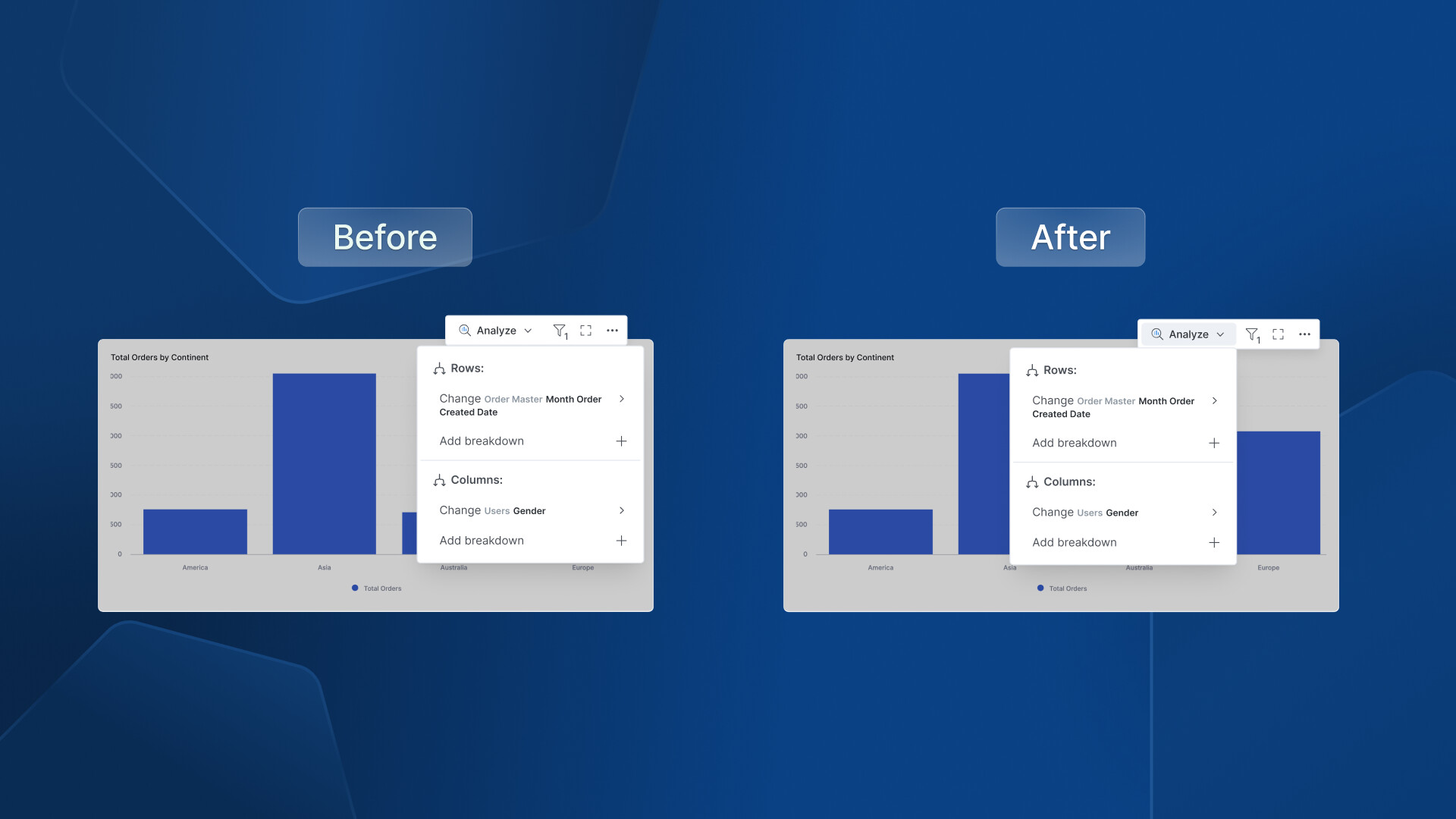
Action Menu Enhancement - Unified action menu by adding active state and right-aligned popover positioning.
General UX & UI Improvements
-
Updated the layout for several Settings pages (Data Sources, Users, Groups, Jobs Monitoring, Activities) to be full-width.
-
Corrected the validation border size to match the filter box, preventing it from appearing disproportionately large.
-
Cleaned up unwanted borders and shadows that were appearing in Tagged Objects item descriptions and the AI text-area component.
-
Standardized the border radius on the destination tab for a more consistent and polished look.
-
Resolved an issue where the loading icon would incorrectly persist after an export job was cancelled in the Notification center; it will now correctly display an ‘error’ icon.
-
Updated the copy writing for reused dashboard edit instructions to be more user-friendly.
-
We’ve fixed an issue where the user access delete popover was appearing in an unexpected position, ensuring it’s now where you’d expect it.
-
The loading icon for user access now correctly spins during data retrieval, providing clearer visual feedback that something is happening.
-
Icons and text within the custom chart dropdown are now properly aligned on staging, ensuring a cleaner and more consistent look.
-
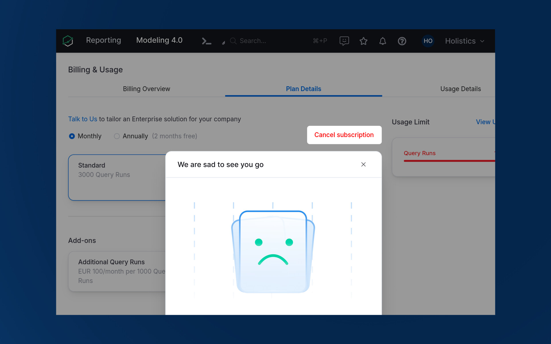
Billing UI Clarity: We improved clarity around the ‘Cancel subscription’ button, especially when navigating plan modifications, and update an image in the confirmation modal.
Development
-
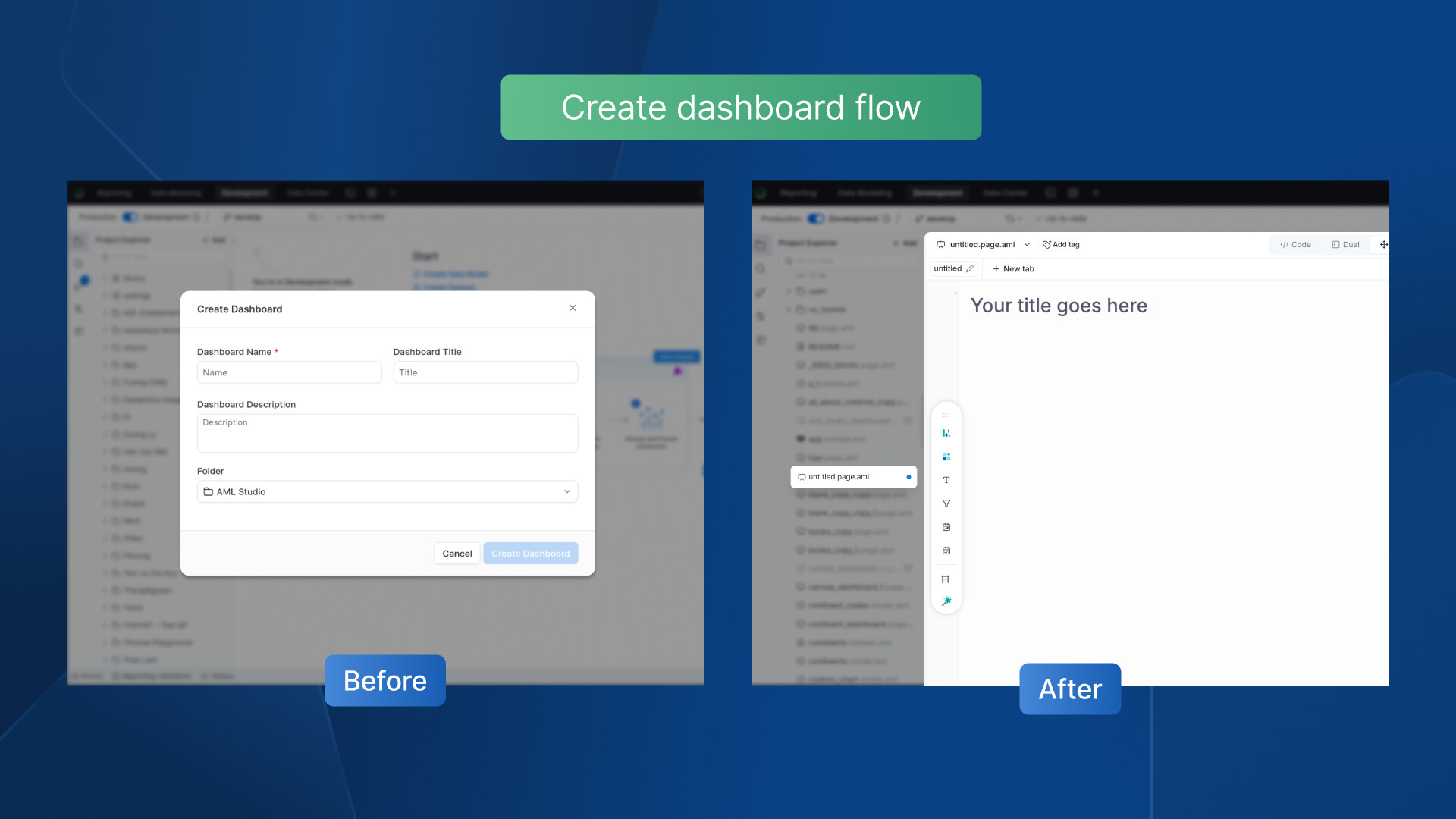
Dashboard Creation Flow - Streamlined the creation process across the development homepage for better consistency. No more modal to help you get straight to work.
-
In read-only mode, the relationships modal will now correctly reflect its non-editable state by disabling switch buttons and hiding options like “Add relationship.”
-
Adjusted the positioning of tooltips to appear closer to their corresponding buttons for better usability.
That wraps up our February updates ![]() .
.
We’re grateful for your ongoing feedback, which continues to inform our product decisions. More improvements are on the way—see you next month!