UX Roundup
Hi community  Small things done right make a big difference. This month, we focused on fixes and improvements that make your day-to-day smoother. Here’s what’s new.
Development
Visual Clarity & Alignment
-
Changed the Delete branch button to red (Tertiary-danger) to emphasize its destructive action
-
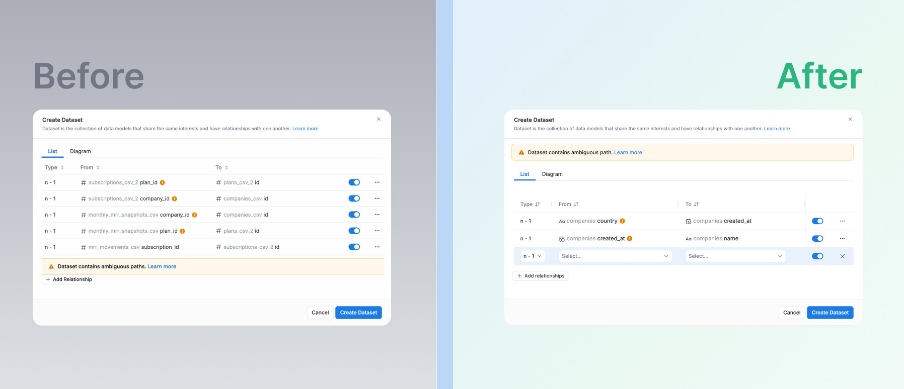
Repositioned AQL error indicators next to header cell text for better clarity
Consistency
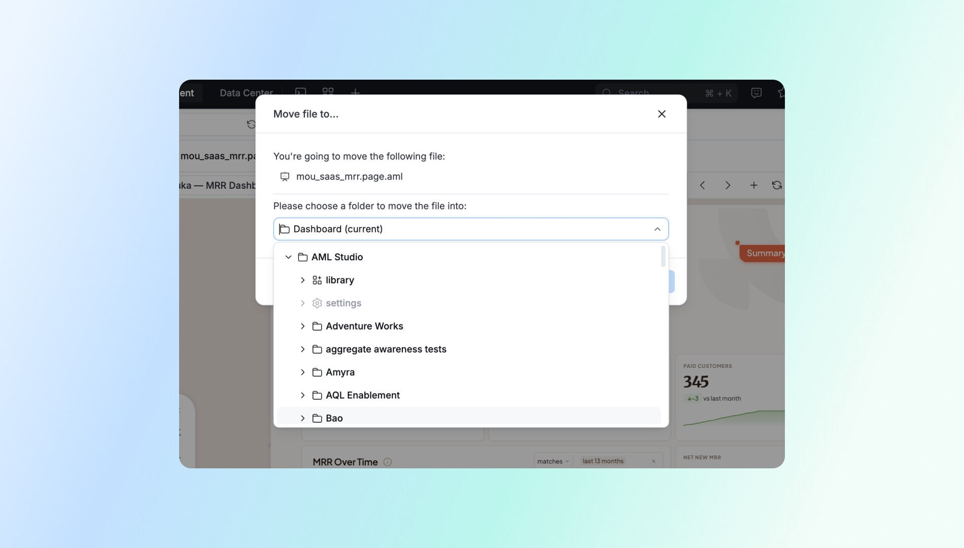
- Corrected folder structure when moving items — library and settings now appear at the top, matching Project Explorer.
Bug Fixes
-
Fixed random preview error in Data Model list view when fields were selected but auto-run was off
-
Fixed blue banner in Rlts Diagram pushing widget controller out of viewport by switching to full-width style
Navigation
- Edit modal now auto-scrolls to and expands the folder containing the dataset in use — no extra search steps needed
Reporting
Correct Components & States
-
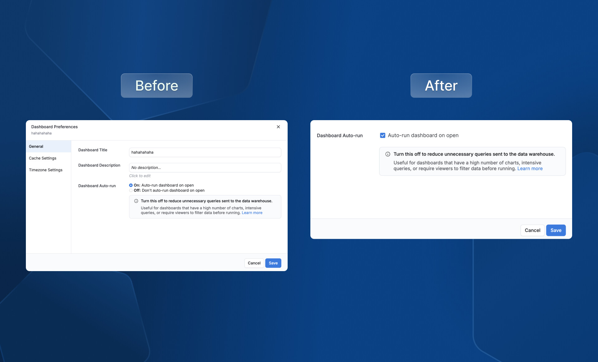
Replaced incorrect radio buttons with checkboxes for Dashboard auto-run settings
-
Added missing indeterminate state for filter checkboxes when partial selection occurs
-
Dataset selector items now show tooltips for full names, with word-breaking for long names
Smart Defaults & Validation
-
Dashboard selector pre-selects the most recently saved-to dashboard when saving a chart
-
Submit button auto-scrolls to the first empty mandatory field on error
Feedback & Shortcuts
-
Saving a visualization now shows a clear Alert — titles like “Block saved” with CTAs: “View block” / “View dashboard”
-
Standardized save shortcut tooltip using a consistent Shortcut component
Layout & Consistency
-
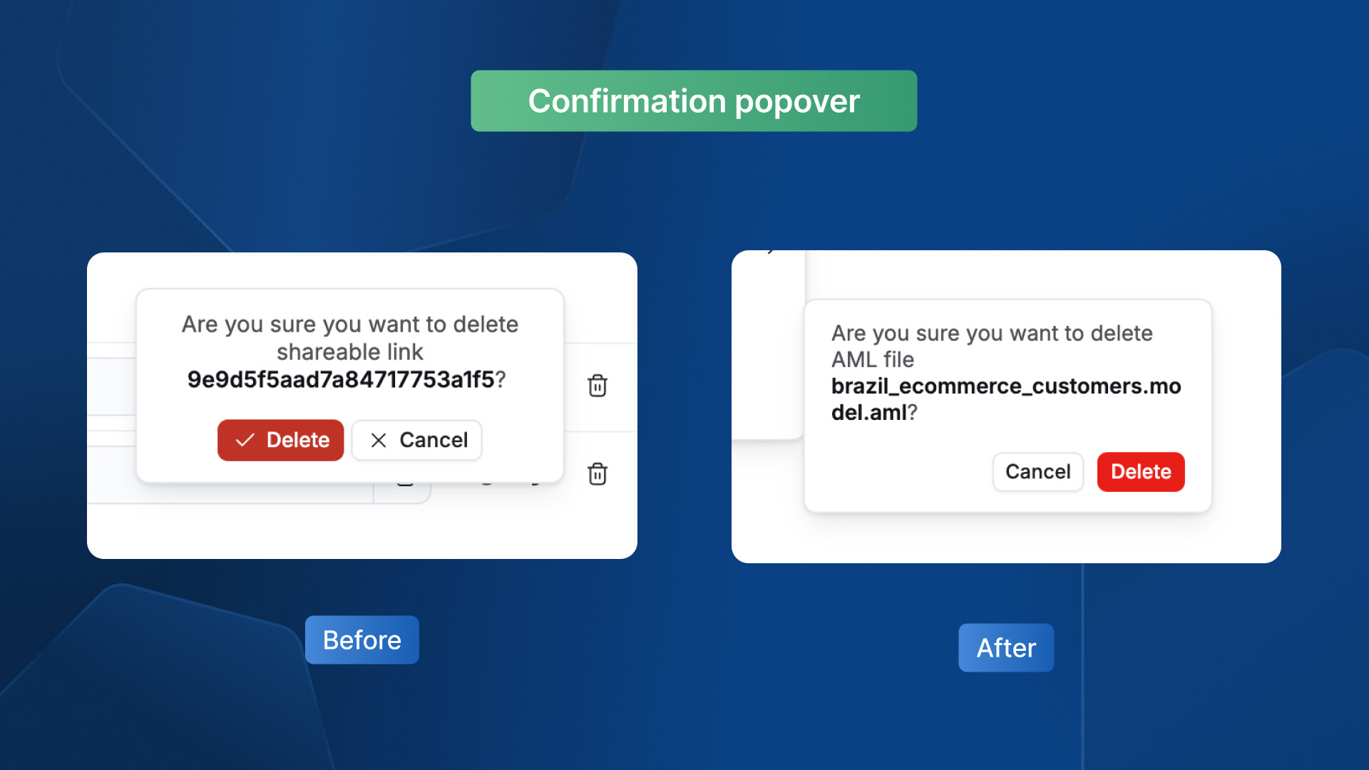
Enhance the delete confirmation pop-up for clarity and consistency
-
Fixed overlapping popovers when adding multiple trend lines — only one displays at a time
-
Standardized empty Dashboard Preferences tab height (max 720px, 24px top/bottom margins)
UX Writing & Field Behavior
-
Softened reused dashboard edit instructions: “This dashboard is a reused dashboard and can only be edited in Development’s code mode.”
-
Title field in Data Schedules now renders
{{$dashboard_title}}consistently with placeholder text; tooltip added for older versions
Others
UX Writing & Copy
-
Revised unsaved changes modal → “Discard changes?” with buttons: “Keep editing” / “Discard changes”
-
Updated Personal Workspace copy for clarity with “Learn more” doc links
-
Changed “Shareable Link” → “Shareable Links”; removed redundant “with…” phrasing
-
Standardized naming:
tenant_name Workspace→ “Reports & Dashboards”,Private→ “Personal” -
Fixed “successfully” typo in toast messages across the app
-
Merged duplicate trial banners into one — new copy: “Talk to an expert for a personalized demo to maximize your trial” with updated image
-
Changed AI field description panel text color to
text.inverted.defaultfor dark background visibility
Layout & Alignment
-
Alerts repositioned to appear where expected without obscuring content
-
Notification timestamps on the right side properly aligned
-
Share empty state images and content centered and spaced
-
VUD Show visualization line elements realigned
-
Admin-o badge changed to icon-only format to prevent cutoff in empty spaces
-
Padding and banner width adjusted for proper spacing and visual hierarchy
-
Settings pages (Data Sources, Users, Groups, Jobs Monitoring, Activities) set to full-width with 24px L/R padding
-
Added 50vw minimum width to Browse pages to prevent unreadable narrow layouts
Component & Interaction Fixes
-
Deduplicated two refresh buttons into a single clear action
-
Clarified X remove icon placement in relation rows
-
Auto-refresh in Jobs Monitoring / Activity pages: checkbox → switch, consistent naming and sizing
-
Selected values in dropdowns now highlighted to show active option
-
Modal footers made sticky at the bottom for cross-app consistency
-
Personal workspace: entire row clickable, … button hidden by default
-
Removed Paste from dashboard/widget action menus — restricted to folders only
Keyboard & Accessibility
-
Improve tab navigation and scrolling experience
-
Cmd/Ctrl-Click on “Ask AI” nav link now opens in a new tab
-
Enter key opens selected items when navigating search recents
-
Mini toasts moved from bottom-right to top-center alert style; exclamation mark removed
Visual Polish
-
Updated illustrations across the platform to new versions
-
Checking status icon changed from warning symbol to loading spinner
Simplification
- Removed redundant vertical tab section in Endorsement & Archive settings — all content visible on a single page
Bug Fix
- Fixed user management search dropping the last character when typing fast
That’s a wrap for this month. Got a bug to report or an idea to share? We’d love to hear it. Your feedback shapes what we build next, so keep it coming 